Accessing Dimensions on GBQ using Tableau
This guide will walk you through the steps necessary to access Dimensions BigQuery data using Tableau, a popular interactive data visualization software.
Please note that the guide and screenshots below have been taken using Tableau Desktop; if you are using other versions of the software, there might be some differences due to the way the user interface looks, however the fundamental steps will be the same.
1. Setting up a GBQ connection
After installing Tableau on your computer, the first thing to do is creating a connection to a Dimensions.ai Google Big Query dataset.
In the following we will connect to the COVID-19 dataset, which can be found in GBQ under the name of covid-19-dimensions-ai.
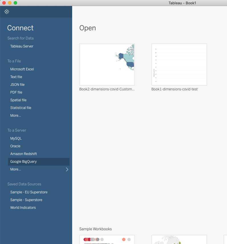
Select ‘Google BigQuery’ from the Connect panel:
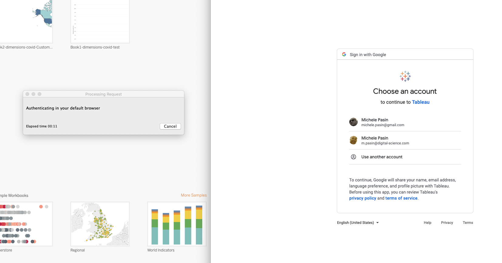
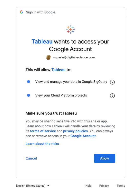
A browser window will pop up, asking you to authenticate. This is done only once per sessions and is needed for Tableau to set up GBQ permissions correctly.
Choose your Google account, select ‘Allow’ and you’ll be redirected to the Tableau application.
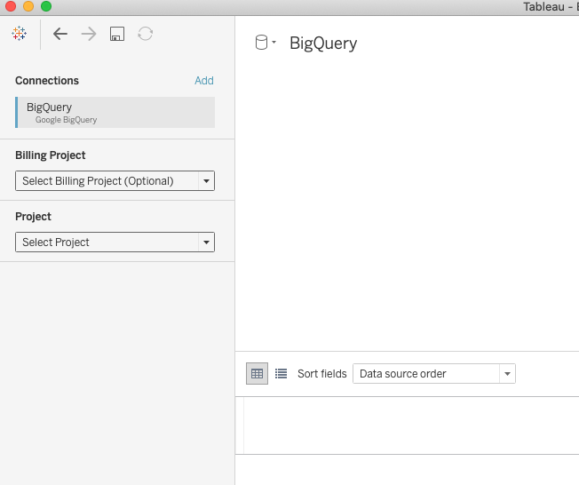
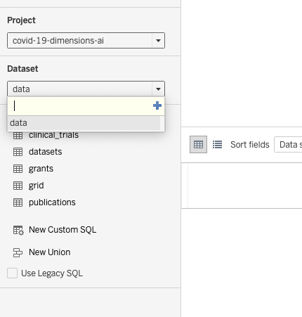
In order to set up the GBQ connection, you need to select three things:
A billing project - this the Google Cloud project holding your billing credentials. Your dashboards consuming GBQ data will be costed against this project.
A GBQ project - this the GBQ database you want to access. This is “covid-19-dimensions-ai” for us. NOTE: if the project name does not appear in the dropdown options, just type it in: “covid-19-dimensions-ai”. Then click on the ‘plus’ sign - a new dropdown will appear.
A dataset - here simply select ‘data’. The list of covid-19 tables will then appear underneath - we’re ready to go!
2. Loading data using SQL
Let’s say we want to create some visualizations showing how many new publications about COVID-19 are available in Dimensions on each day. Also, we’d like to see what are the main countries the authors come from.
Even though Tableau permits to access the entire GBQ data tables simply by clicking on them, you’ll soon see that those tables contain a lot of information, some of which may not be relevant to the visualization we want to create.
Hence, for our use case, it’s more cost-efficient to bring into Tableau only the data we need. This is easily done by using a ‘custom query’ in order to generate a new dataset. The custom query selects a subset of publications fields that are useful for our visualization:
SELECT p.id, title.preferred, doi, year, journal.title as journal, publisher.name as publisher, type, date, date_inserted, citations_count, altmetrics.score as altmetrics_score, open_access_categories, cat_for.name as category, research_org_country_names

FROM `covid-19-dimensions-ai.data.publications` p,

UNNEST(research_org_country_names) as research_org_country_names,

UNNEST(open_access_categories) as open_access_categories,

UNNEST(category_for.first_level.full) as cat_for
Another advantage of using a custom query is that we can simplify GBQ’s ‘nested’ data, so that it becomes easier to process it with Tableau.
Nested data is a common approach to improve database performance, however data visualization tools often do not handle these data structures natively (eg see also this article: Using BigQuery Standard SQL and Nested Fields ). So, in the query above, we ‘unnest’ a the fields research_org_country_names , open_access_categories and category_for so that we can reuse them in Tableau.
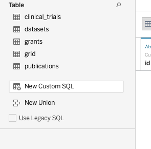
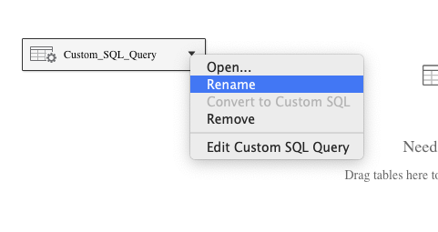
So, putting this all together: first of all, we click on ‘New Custom SQL’ in the left panel.
Second, we enter the SQL query above in the pop up window that appears.
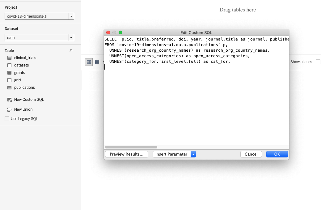
We hit ‘ok’ to load the data.
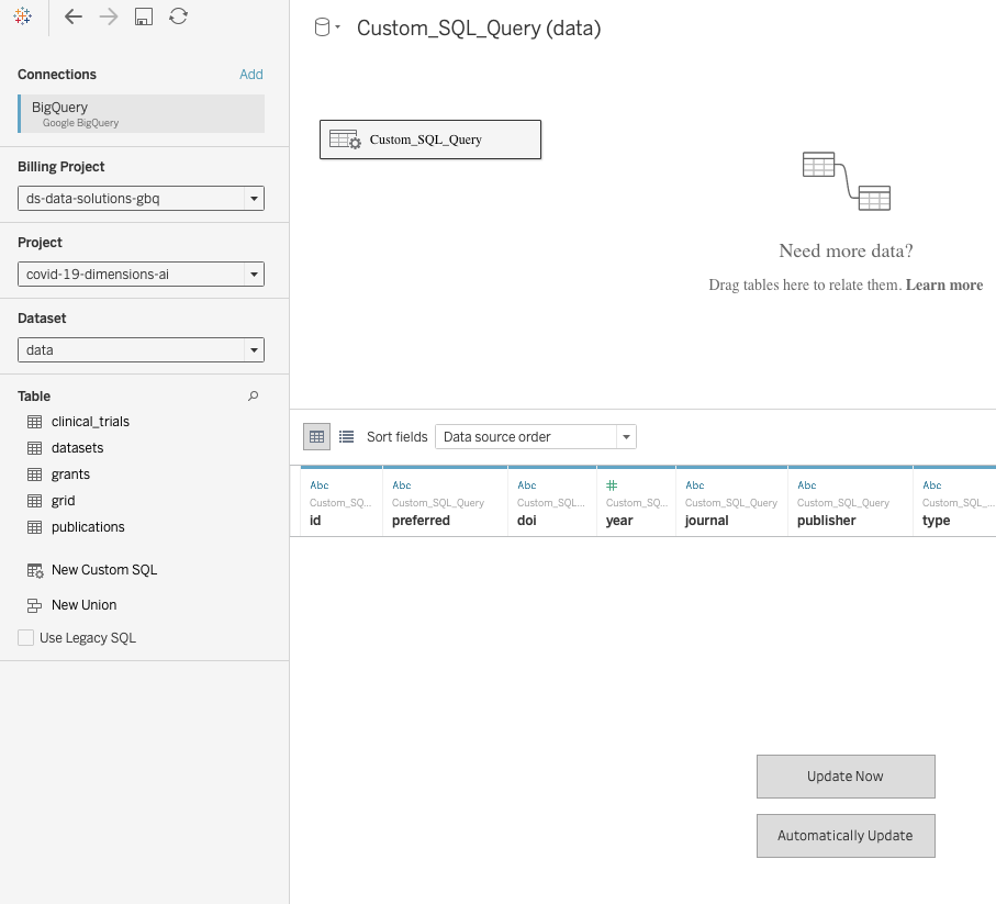
Finally, we can rename the ‘custom_SQL_query’ object to ‘Publications’
3. Creating a report
Open a new sheet, and you’ll see all the fields available via the newly created ‘Publications’ data source.
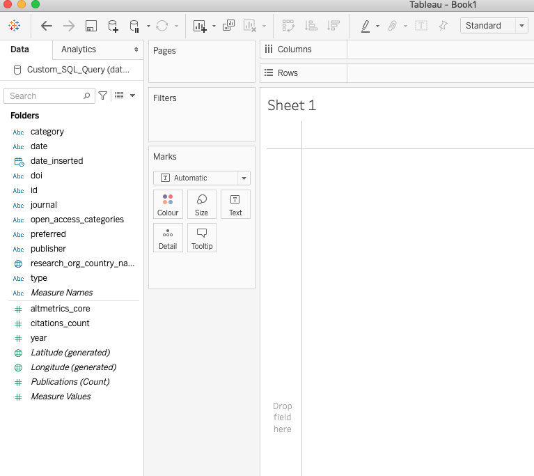
Select the following fields from the left panel:
Publications (Count)
Research_org_country_name
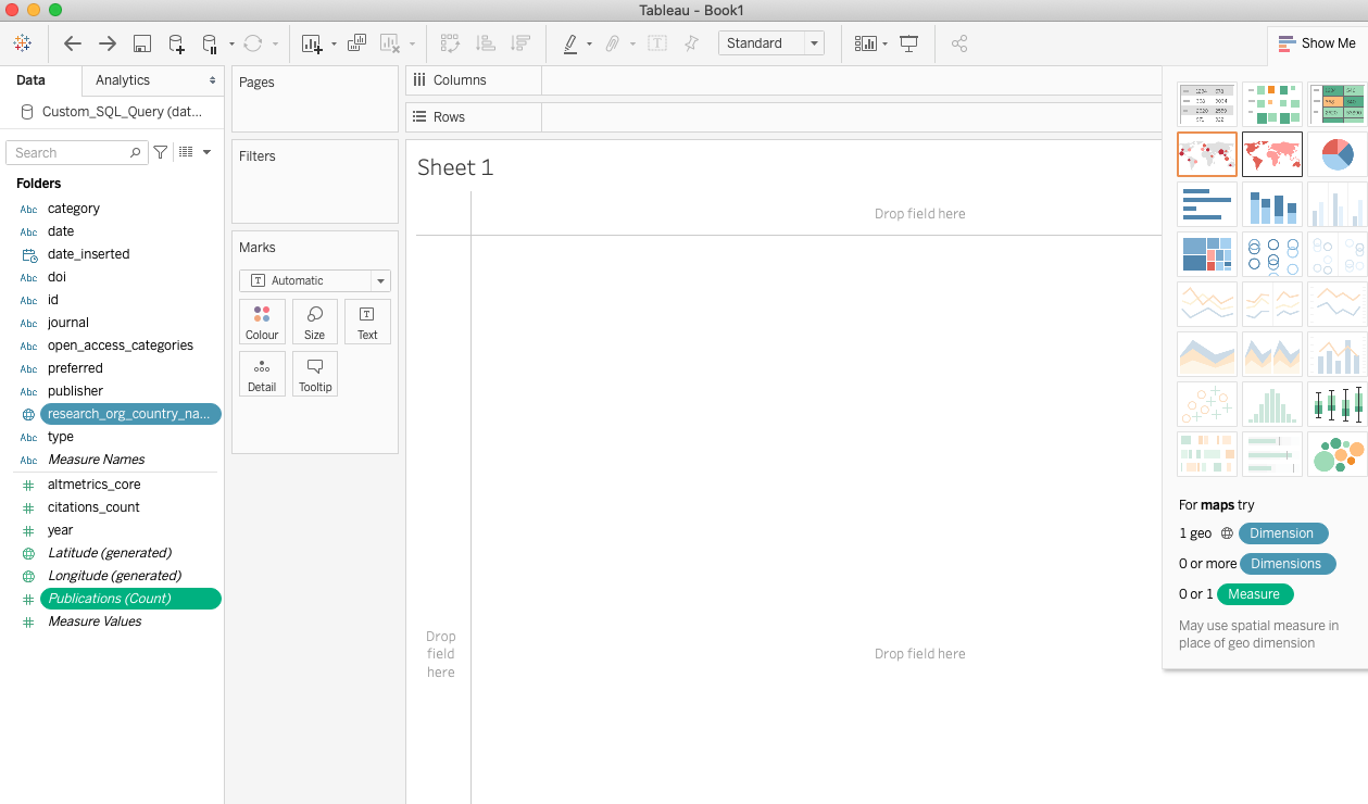
Then, select the ‘maps’ visualization from the right panel.
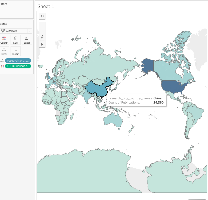
Now, let’s create a representation of the number of publications per month, from our COVID-19 dataset.
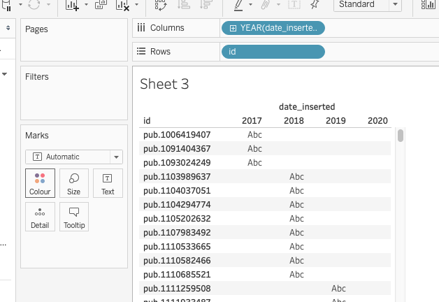
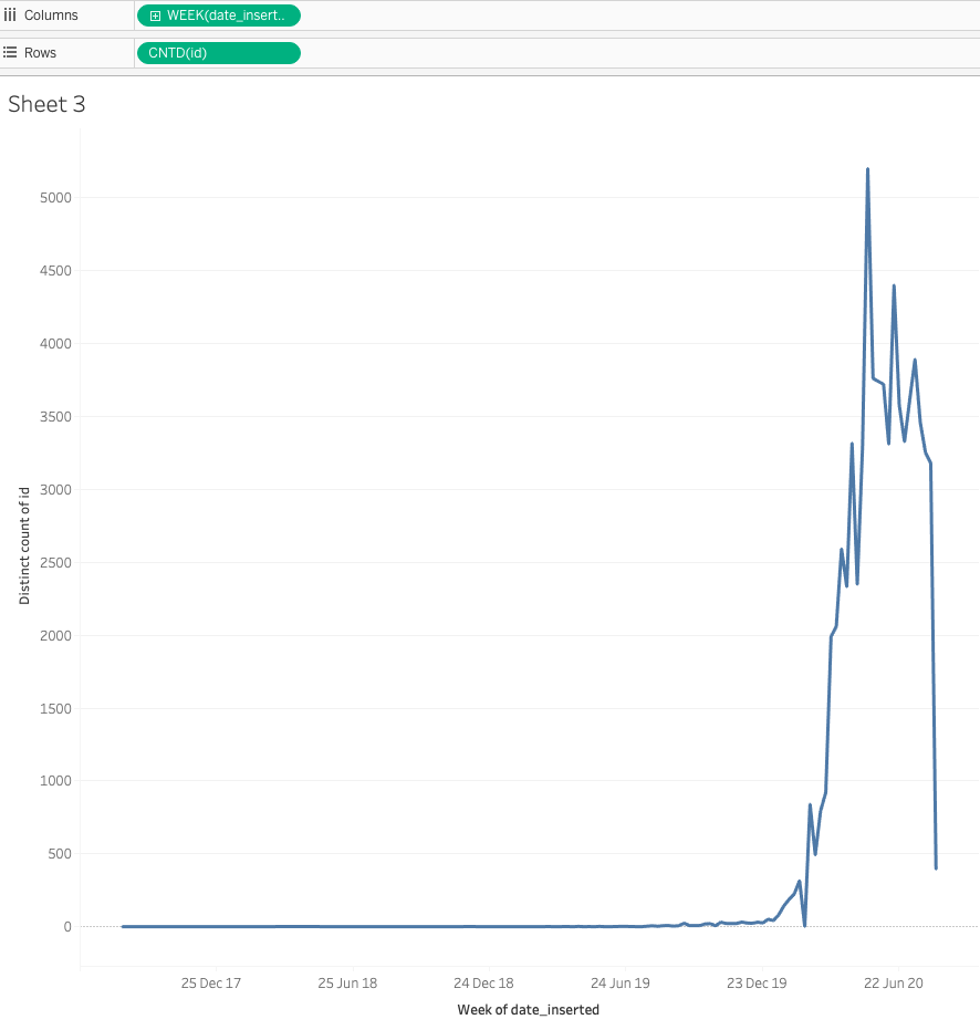
Create a new ‘sheet’ and drag the ‘date_inserted’ field to the Columns input, and the ‘id’ field to the Rows input. You should see something like this:
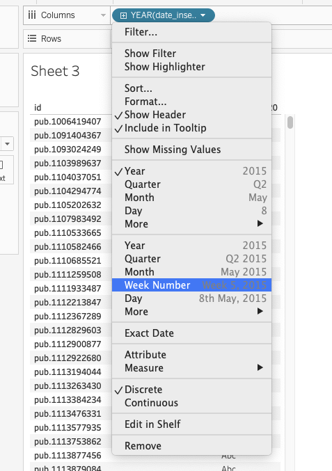
Now we can change the aggregations fo these fields. Choose ‘Week Number’ for ‘date inserted’, as below:
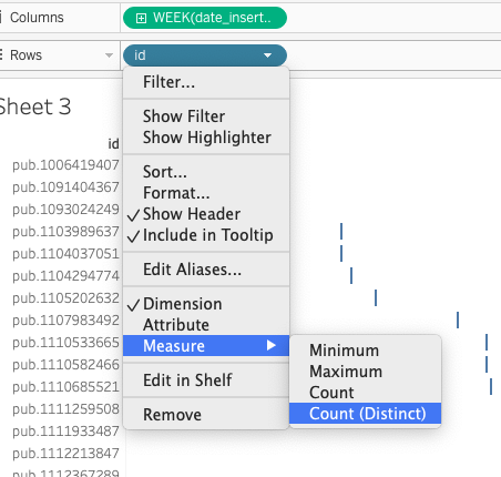
Choose ‘Count (Distinct)’ for ‘id’, as below:
That’s it! You should now be able to see a line chart representing how many new publications are available each week:
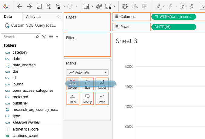
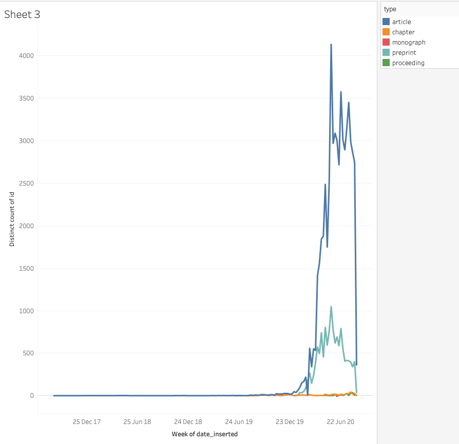
Last thing: grab the ‘type’ field onto the ‘Colour’ setting in the ‘Marks’ box.
Now we have applied a publication-type segmentation on top of our line chart:
That’s it!
Needless to say, this only scratches the surface of what can be done by using Tableau and Dimensions.ai GBQ data.
To learn more, see the Build a Basic View to Explore Your Data Tableau tutorial.