Building a COVID-19 Dashboard using Google Data Studio
In this blog post we’ll go through the main steps needed to construct a Data Studio dashboard using the freely available Dimensions COVID-19 dataset on Google Big Query.
At the end of this tutorial you’ll learn about the following topics:
How to access the Dimensions COVID-19 dataset.
How to make sense of the Dimensions data model using the online documentation and other free resources.
How to extract data from BigQuery using SQL.
How to use this data to create a live Google Data Studio dashboard about COVID-19 publications.
1. Accessing the free COVID-19 dataset
In March 2020 we have made available all COVID-19 related published articles, preprints, datasets, grants and clinical trials from Dimensions free for anyone to access (see https://www.dimensions.ai/covid19/). The intent is to help the research community to stay up to date in this fast-moving situation, and greatly reduce the time that would otherwise be required to collate this information from many disparate sources.
As part of this initiative, more recently we have created a Google BigQuery (GBQ) version of the COVID-19 dataset, which contains a richer structured version of the data we have been publishing in the form of Excel files since last March.
The Dimensions COVID-19 datasetis fully cloud-hosted and can be queried using the SQL language. It is part of a growing number of Google Cloud public datasets that are free to use and can be used jointly to perform analyses and uncover new insights in the cloud.
Note
The COVID-19 dataset on Google BigQuery is essentially the ‘slice’ of Dimensions containing documents related to COVID-19. If you are interested in accessing the full Dimensions database using GBQ, see this page for more information.
The Dimensions COVID-19 dataset conforms 100% to the official Dimensions data model, hence the data source tables can be used to inspect what fields are available.
What you need to see the data
In order to access the COVID-19 dataset on GBQ you need two things. First, you need to have a Google account (most often, a gmail address means that you have it already). Secondly, you need to be able to access the Google Cloud Platform (GCP).
If you’re new to the GCP environment, not to worry. There are tons of tutorials that can help you understand what this is all about. A good place to start is probably the Getting started using BigQuery and Getting started using the Cloud Console tutorials.
If you are more hands-on, instead, these are the simple steps to get started:
Visit the page https://console.cloud.google.com/ and set up a free GCP account, after agreeing to the Terms of Service.
Pin the ‘BigQuery’ app to your console so that it’s easier to find it later.
Create a new BigQuery project and give it a memorable name eg ‘covid-data-demo’.
Find the covid-19-dimensions-ai dataset, using the public datasets explorer tool, and add it to your project.
Grab a coffee! You’re ready to go. If you want to test that, do try out a couple of SQL queries to make sure it’s all working!
In the video below you can see these steps in practice.
Once you’re up and running, try opening up the COVID dataset in the GBQ console, and typing in this query:
SELECT COUNT(*) as total_pubs
FROM
  `covid-19-dimensions-ai.data.publications`
The SQL query above is a pretty standard way to count how many records
exist in a table; in our case, the covid-19-dimensions-ai.data.publications table.
Note
Google BigQuery can be accessed using Standard SQL. That means that many of you can leverage pre-existing SQL knowledge in order to work with it, even though BigQuery contains extra features that are not traditionally found in SQL databases (e.g. structured and repeated fields, we’ll see talk more about it later).
The query returns 180k+ publications (at the time of writing ie October 28, 2020). This number will soon be obsolete, since the rate of publishing in the COVID-19 area is pretty impressive.
So, let’s make another query. This time we want to get a feeling for how
many publications enter the Dimensions database each month. This can be
achieved by using the field _date_inserted_ (see the
docs
for more info):
SELECT
   COUNT(*) AS total_pubs,
   EXTRACT(MONTH
   FROM
      date_inserted) AS month
FROM
   `covid-19-dimensions-ai.data.publications`
WHERE
   EXTRACT(YEAR
   FROM
      date_inserted) = 2020
GROUP BY
   month
ORDER BY
   month DESC
The data you’ll get should look like this:
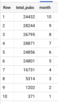
Pretty astonishing uh? The publications about COVID-19 have been steadily increasing since the beginning of the year.
From data results to a bar chart
Finally, let’s see how we can quickly transform these query results into a bar chart.
We can easily visualize this data using Google Data Studio, another free tool from Google. From the BigQuery console, there’s a nice shortcut for creating visualizations: simply click on the ‘Explore with Data Studio’ menu link and you’ll be taken to a new Data Studio project, showing your query results in a tabular format:
Obviously a tabular representation of the data is not what we want. But it’s actually rather easy to create a bar chart, from this intermediate representation. Just follow these steps:
Select ‘chart:bar’ from the right menu
In the Dimensions field, select: ‘Month’ - this is to have the months on the x axis
In the Metric field, select: ‘total_pubs’ - this is to have the publications count on the y axis
Finally, in the Sort field, select: ‘month’ and ‘ascending’ - this is to ensure the chart is ordered correctly.
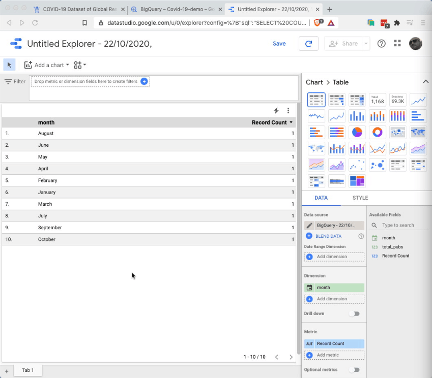
Et voila - here we have a nice bar chart showing the (pretty shocking) increase of publications on COVID-19 over the months of 2020.
Time to get a coffee and enjoy what we’ve achieved so far!
In the next sections we’ll look at building a more sophisticated dashboard using other fields from the publications dataset. Before that though, it’s better to take one step back and learn a bit more about the Dimensions data model.
2. Getting familiar with Dimensions’ data model
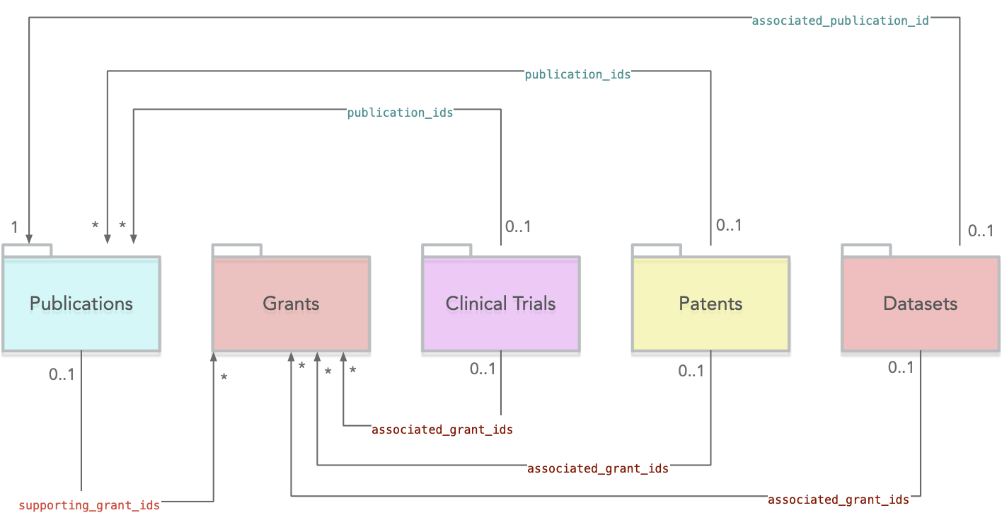
It’s probably fair to say that at the heart of it all there’s Dimensions data model. This model incarnates the key features of the core research-related objects (such as publications, grants, patents, etc..) you can explore using Dimensions.
Dimensions’ model is rich and very interconnected, so it’s not a bad idea to set aside some time to delve into it, if you want to become a Dimensions power user. The good news is though, many of the concepts behind it won’t be totally alien to you since - at the end of the day - the model represents objects you may be already familiar with e.g. scientific articles, researchers, or clinical trials.
The main objects in Dimensions’ model correspond to the 6 top sections of the Dimensions webapp: Publications, Datasets, Grants, Patents, Clinical Trials and Policy Documents.
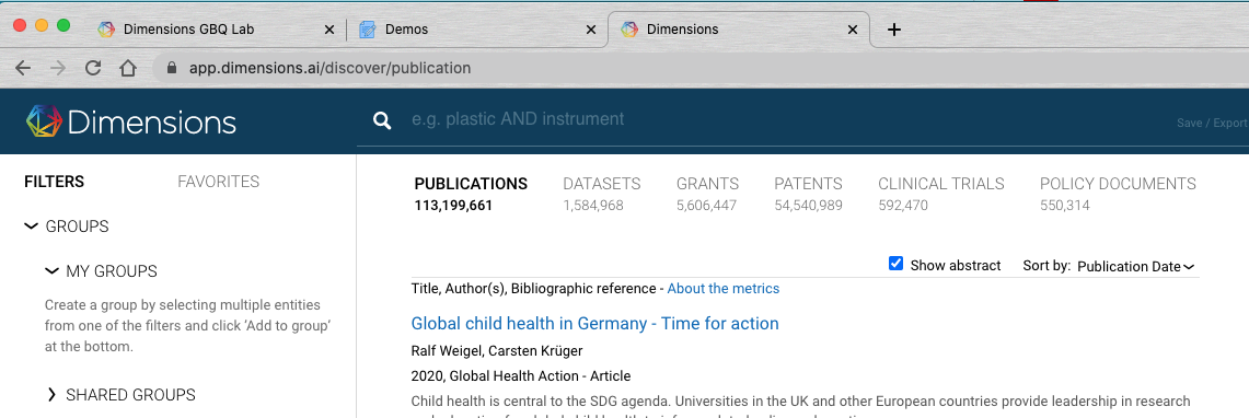
Each of these objects is further characterised by having properties eg names and affiliations for researchers, or year and categories for publications. The left-hand side filters in Dimensions provide a good visual summary of the fields available for each object.
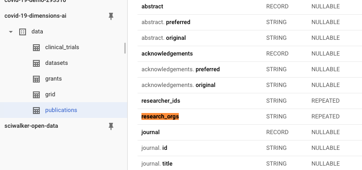
Now, if we look at the main tables of the Dimensions COVID-19 dataset via the GBQ console, you’ll be able to quickly spot the same objects on the left sidebar:
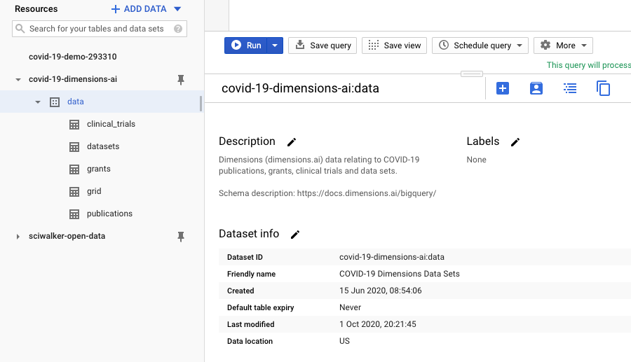
You’ll notice that some objects are missing (e.g. patents and policy documents). That’s because those content types are not available in the free COVID dataset currently (as opposed to the full version of Dimensions on GBQ).
Also, you’ll notice that we have an extra object called ‘Grid’: this is the GRID Organizations database used throughout Dimensions in order to disambiguate author affiliations and, more generally, research-related organizations mentioned in documents. In GBQ, this dataset is a first class object, meaning that you can search it and perform analysis on this data more easily.
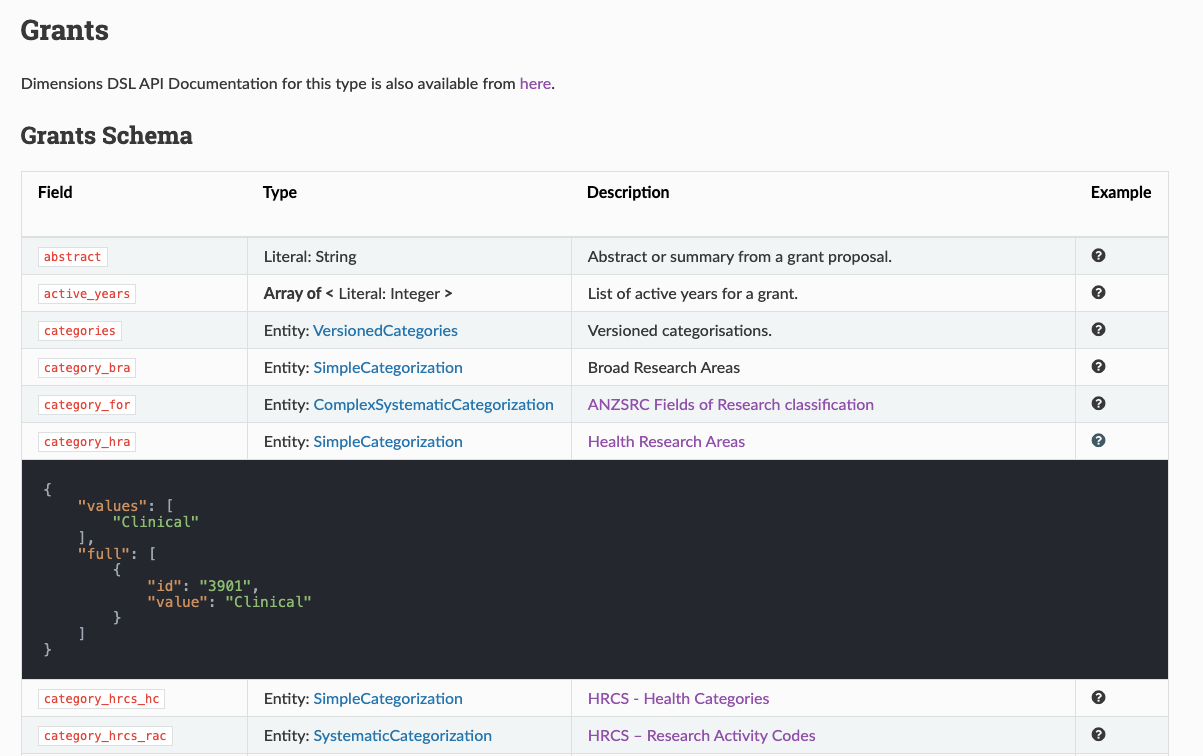
What about the object properties? In GBQ you can’t click on filters as in the webapp, but those objects properties are still visible as soon as one opens up one of the Dimensions datasets, e.g. this is what the grants one looks like:
There are dozens of properties available, thus making it possible to analyse and segment the data in countless ways. If you want to explore what’s available, then the key resource to keep in mind is the official data model documentation.
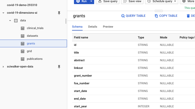
The documentation provides all the info you need about what fields are available for each object type, their structure and it also includes examples of what the data look like. So, for example, if you are interested in Grants, head over to the grants-schema page and see what’s available!
Now that we’re a bit more familiar with the Dimensions data model, we can take a look at how to construct a more sophisticated query to pull out Publications data.
3. Building a publications query
The main raw material for our COVID-19 publications dashboard is the data we will use to create charts and other visualizations. So it makes sense to spend some time on this aspect, specifically on how to construct a SQL query that allows us to extract just the data we need.
First, let’s outline what we’re trying to achieve. At a high level, we would like to generate a dashboard that allows users to discover and monitor publications related to the COVID-19 topic. More specifically, users should be able to:
Navigate basic metadata about publications eg in order to follow up on them
Highlight time-based trends about the publications eg how many publications we have per month or week
Discover publications of interest by manipulating other dimensions eg the organizations/countries authors are affiliated to, or the broad subject areas of the publications
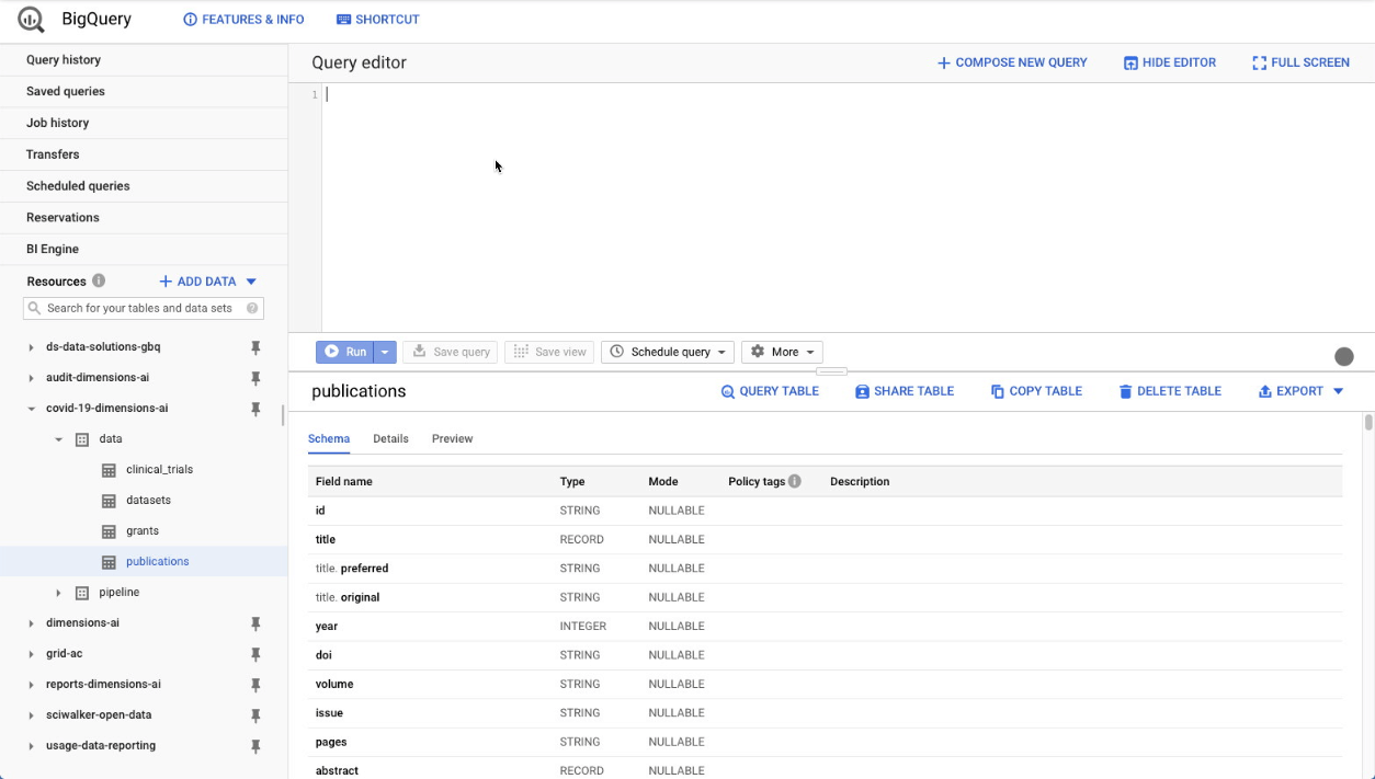
A SQL query that pulls basic publications metadata could look as follows:
SELECT
 p.id,
 p.title.preferred AS title,
 p.doi,
 p.year,
 P.journal.title as journal,
 p.type,
 p.date AS date_publication,
 p.date_inserted,
FROM
 `covid-19-dimensions-ai.data.publications` p
WHERE
 EXTRACT(YEAR
 FROM
   date_inserted) >= 2020
The fields’ meaning should be rather self-explanatory, but feel free to look at the publication model documentation in case you need more background.
There are a couple of things worth noting:
Publications have both a publication date field (that in some cases can be set to the future e.g. ) and a_ date-inserted_ field. The latter indicates when the publication was added to Dimensions, so it’ll always be < today. Note: that’s the main date we’re interested in, within our analysis, as it’ll give us a sense of how active this topic is (as opposed to publication dates which are often set in the future).
In order to make the publications selection more relevant for the COVID-19 topic, we’re selecting only publications added to Dimensions in 2020.
Try running the query above in the GBQ console. You’ll soon find out that the journal title field doesn’t always appear, and that’s simply because Dimensions includes other publications types (e.g. books) that use a different title field. We can work around this problem by combining all ‘title-like’ fields into a new field venue, using the coalesce SQL function.
COALESCE(p.journal.title, p.proceedings_title.preferred, p.book_title.preferred, p.book_series_title.preferred) AS venue
Also, we can add citations counts and altmetric scores to the results, as those are pretty useful ways to measure the impact of publications. So an improved version of the query will look like this:
SELECT
 p.id,
 p.title.preferred AS title,
 p.doi,
 p.year,
 COALESCE(p.journal.title, p.proceedings_title.preferred, p.book_title.preferred, p.book_series_title.preferred) AS venue,
 p.type,
 p.date AS date_publication,
 p.date_inserted,
 p.altmetrics.score AS altmetrics_score,
 p.metrics.times_cited,
FROM
 `covid-19-dimensions-ai.data.publications` p
WHERE
 EXTRACT(YEAR
 FROM
   date_inserted) >= 2020
Adding research organizations information
As briefly mentioned above, Google BigQuery permits to include
structured and repeated fields within tables, which is one of the
features making it
different
from other SQL technologies. You’ll find examples of this approach
throughout the Dimensions database, for example with the field
research_orgs, which contains a list of all the author affiliations
of publications, as GRID identifier (eg
‘grid.4991.5’).
In particular, repeated fields fields are easy to spot, as the ‘mode’ column in the GBQ console clearly marks them as ‘REPEATED’.
So far in our SQL queries above we’ve been adding fields that have a single value per publication (eg title or publication date).
In order to work with repeated fields, we must use a special command: the UNNEST operator. This is simply a way of ‘unpacking’ the contents of a repeated field into separate rows, so that they can be used in the query e.g. for counting or grouping. This is what it looks like:
SELECT research_orgs_grids
FROM
 `covid-19-dimensions-ai.data.publications` p
LEFT JOIN
  UNNEST(research_orgs) AS research_orgs_grids
The results of UNNEST can be thought of as a separate table which is
joined up with the main query results. In particular, in this case we
are including the unnested research organizations data via a LEFT
JOIN,
to ensure that all publications get extracted irrespectively of whether
there is some data in the research_orgs field or not.
Try out the query above. As you will see, it returns a list of GRID identifiers (eg grid.4991.5) that, although they represent unambiguously organizations, are probably rather impenetrable for our dashboards users. Instead, we would like to display human readable names of research organizations. The way to achieve this is to use these GRID IDs to perform another JOIN on the ‘grid’ table of the COVID-19 dataset:
SELECT grid.id, grid.name
FROM
 `covid-19-dimensions-ai.data.publications` p
LEFT JOIN
  UNNEST(research_orgs) AS research_orgs_grids
LEFT JOIN
  `covid-19-dimensions-ai.data.grid` grid
ON grid.id=research_orgs_grids
So, all in all, the full query including organizations data will look like this:
SELECT
 p.id,
 p.title.preferred AS title,
 p.doi,
 p.year,
 COALESCE(p.journal.title, p.proceedings_title.preferred, p.book_title.preferred, p.book_series_title.preferred) AS venue,
 p.type,
 p.date AS date_publication,
 p.date_inserted,
 p.altmetrics.score AS altmetrics_score,
 p.metrics.times_cited,
 grid.id AS gridid,
 grid.name AS gridname,
 grid.address.country AS gridcountry,
 grid.address.city AS gridcity,
FROM
 `covid-19-dimensions-ai.data.publications` p
LEFT JOIN
  UNNEST(research_orgs) AS research_orgs_grids
LEFT JOIN
  `covid-19-dimensions-ai.data.grid` grid
ON grid.id=research_orgs_grids
WHERE
 EXTRACT(YEAR
 FROM
   date_inserted) >= 2020
That’s it!
Adding categories & open access information
Now that we know how to use UNNEST, there are two more fields of type ‘repeated’ that we want to bring into the mix:
FOR Categories - this is a categorization system that covers all areas of research and is used extensively in Dimensions.
Open access status - this field tells us whether a publication is behind a paywall, or not, in particular by including detailed information about its OA status
The extra SQL we need looks like this
LEFT JOIN
UNNEST(p.open_access_categories) AS open_access_categories
LEFT JOIN
UNNEST(p.category_for.first_level.full) AS cat_for
Consequently, the final query that we’ll be using in our dashboard becomes:
SELECT
   p.id,
   p.title.preferred AS title,
   p.doi,
   p.year,
   COALESCE(p.journal.title, p.proceedings_title.preferred, p.book_title.preferred, p.book_series_title.preferred) AS venue,
   p.type,
   p.date AS date_publication,
   p.date_inserted,
   p.altmetrics.score AS altmetrics_score,
   p.metrics.times_cited,
   grid.id AS gridid,
   grid.name AS gridname,
   grid.address.country AS gridcountry,
   grid.address.city AS gridcity,
   open_access_categories,
   cat_for.name AS category_for,
FROM
   `covid-19-dimensions-ai.data.publications` p
LEFT JOIN
   UNNEST(research_orgs) AS research_orgs_grids
LEFT JOIN
   `covid-19-dimensions-ai.data.grid` grid
ON
   grid.id=research_orgs_grids
LEFT JOIN
   UNNEST(p.open_access_categories) AS open_access_categories
LEFT JOIN
   UNNEST(p.category_for.first_level.full) AS cat_for
WHERE
   EXTRACT(YEAR FROM date_inserted) >= 2020
Now that the query is ready, the only thing left to do is to use it to build a Data Studio dashboard. Read on to find out how!
4. Building a Data Studio dashboard
As mentioned above, Google Data Studio is a powerful free tool for building data visualizations and interactive dashboards. Similarly to other softwares like Tableau and Qlik, Data Studio features a BigQuery data connector that allows you to enter a SQL query in order to extract the data you want to use in the report.
The online documentation for Data Studio contains links to many articles and video tutorials, if you want to find out more about this software.
But for the purpose of this tutorial, you can also skip all of that and just follow the video below in order to construct a COVID-19 publications dashboard from the ground up.
These are the mains steps we’re going to take:
Step 1. Create a brand new Data Studio report by going to https://datastudio.google.com/. If you’ve never been there before, you might be asked to agree to the T&Cs too. Of course you want to say yes to that!
Step 2. Add data to the report by using the BigQuery connector and the ‘Custom query’ option. The query we’re gonna use is of course the one we developed in section 3 of this tutorial. You can copy and paste it from there.
Step 3. The report is now ready to be edited. Have a look around at the various menus so to get more familiar with the user interface.
Step 4. Build a Publications metadata table. In this table we want to display the key fields we need to identify and follow up on publications we are interested in.
Step 5. Create a dashboard header. We can add a title and a few overview ‘score’ cards, showing the total number of publications available, the total number of related organizations etc..
Step 6. Show some Open Access statistics using a doughnut chart. This chart will tell us quickly how many publications are readily available for reading, or not.
Step 7. Build a world map of the countries/cities of the research organizations the publications’ authors are affiliated with.
Step 8. Add a timeline of the number of new publications being added to the Dimensions database on each week (since 2020).
Step 9. Add a treemap of the most popular Field of Research categories. These categories are added to publications automatically as they enter the Dimensions database (if abstracts are available).
Step 10. Add a Research organizations table heatmap. This view is going to complement the world map above, by providing more details about the research organizations using a table.
Step 11. Preview the report by clicking on ‘View’. In particular, try out the charts interactivity: by clicking on any of the visualizations, the whole dashboard will update. You’ll quickly see how the dashboard can become a powerful discovery tool!
Step 12. Finally, we can generate a dynamic ‘hyperlink’ field back to Dimensions, by using publications titles and IDs values together. The Dimensions URL for publications is stable, so we can leverage Data Studio’s hyperlink and concat commands to generate that web address on the fly using this formula:
HYPERLINK(CONCAT("https://app.dimensions.ai/details/publication/", id), title)
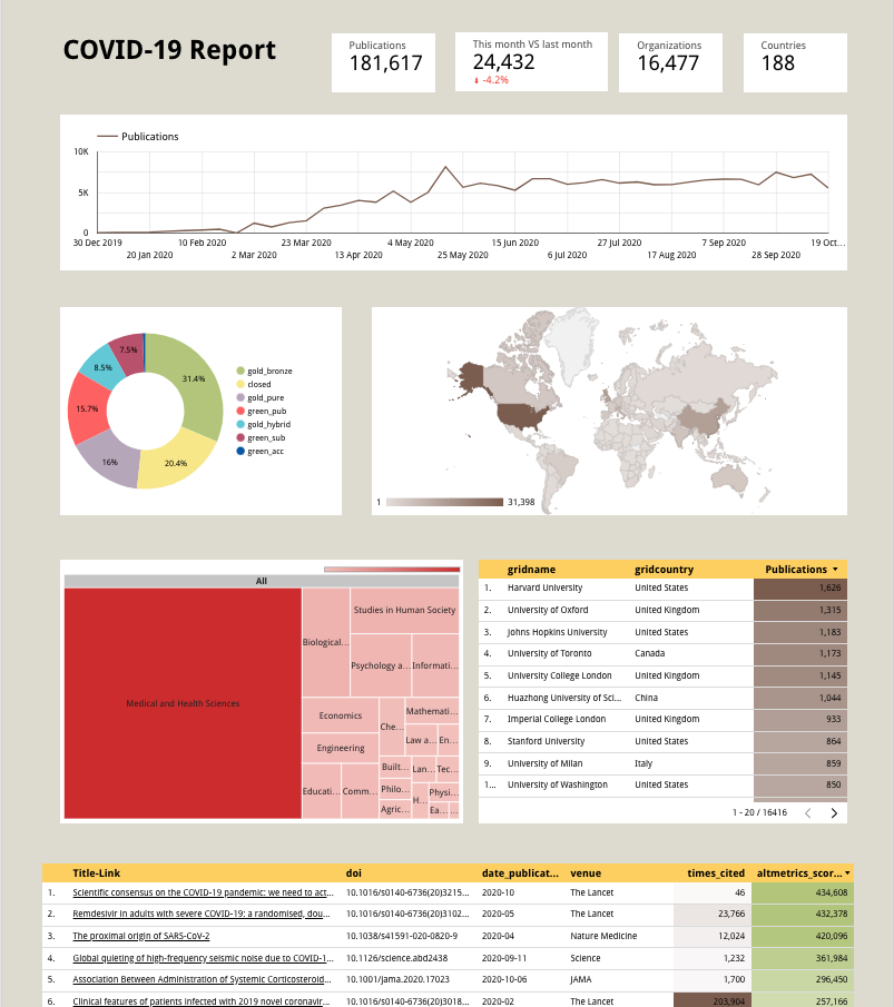
At the end of it, your dashboard will look similar to this one:
5. Conclusions
In this tutorial we have demonstrated how to build a simple yet powerful publications dashboard using the Dimensions COVID-19 dataset on Google Big Query and other free tools.
What you’ve learned so far only scratches the surface of what can be done with Dimensions data and Google BigQuery. But hopefully it’s given you enough information to start making your own dashboards, either using Dimensions data only, or by combining it with your own data or one of the many public datasets available online.
For more information and to stay up to date on our COVID-19 activities, make sure you bookmark https://www.dimensions.ai/covid19/. And please let us know how you’re making use of these data - we’d love to hear from you!